Friday, 16 December 2011

[Animation] Squirrel & the Nut

This was a small project I did in University, I worked with animator Tony Garth, the animator in the famous television cartoon "Danger Mouse". He taught us the 12 basic animation principles: Squash and Stretch, Anticipation, Staging, Straight ahead action and Pose to Pose, Follow through and Overlapping Action, Slow in and Slow out, Arcs, Secondary action, Timing, Exaggeration, Solid Drawing ans finally Appeal. We where told to create a small animation using one of these principles, I chose anticipation so and created the animation using this principles. We where to create concept art for the character, and also a quick storyboard to prepair for the animation. Below is the animation:

Similar to the Transformation Animation I found this animation to be easy to do, but very time consuming. I used a lightbox to see through the paper to create a smooth animation. It is the first time I have ever had to animate a character and keep him looking like the character even when squashing and stretching him, unlike the Transformation Animation in which the character I had was changing into something completely different. I think doing these small animations are great practice for the future when I decide to key frame my animations in Flash like I said I was going to do in the Loop and for when I want to do more Lightbox animations. Tony Garth also showed me how to use the 'Trace Bitmap' in Flash, because of this I was able to edit the drawings and animate them. This helped me keep the character aligned in each frame and also let me resize the images to fit in my work space, unlike in the Transformation Animation when I used Adobe Premiere to animate the images.

I found this animation easy, but very time consuming as it took overall 7 hours to draw all 70 frames. Unlike the Transformation Animation I didn't have a problem with the number of lightboxes as I stayed behind one night after uni had finished and then drew all of the frames out. The following night I scanned all of the images into my computer one by one, the next day I put them all into Flash and animated them. There were no major problems drawing these really, I had a problem with the ending as I thought having the character walk off screen would be too difficult and would require a whole lot more time. To overcome this I had the character become too heavy until he falls through the floor, although in my own personal opinion I think that the scene ends far too fast.

The main focus on this animation was to include one or more animation principles into the animation, Choosing Anticipation and Squash and Stretch I think I achieved the main focus well. When the character leans back it shows the anticipation of him about to eat the giant coconut, when he does eat the coconut he stretches in the form of the coconut until he plummets into the ground. I would have added more of the principles but that would require more frames and more time, if I was to do another animation like this or re-due this animation I would be sure to add more principles.

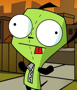
The main character is a character I designed myself, a grey squirrel with a red fez on his head. Although the squirrel’s design idea was influenced from both cartoon characters; Gir from the television cartoon ‘Invader Zim’ and Foamy the Squirrel from the flash series ‘Foamy the Squirrel’. I wanted to make him look cute and small, similar to Gir when he is a dog suit so I tried to make him look similar to that, the design of the squirrel was taken from the character Foamy with his large eyes, grey design, large tail but small ears.

The intention of the animation was to show the animation principles in animation form; I showed two of the principles both Anticipation and Squash and Stretch. Personally I think I got the intention across to the audience by showing these two, mainly the Anticipation over the Squash and Stretch as you only see the character stretch whereas the whole first scene in the animation is anticipation. Another intention was to design a character and animate it from scratch, after Tony gave me feedback on my original character designs he said, “I was inspired by Manga, I need to show my own drawing style” so I decided to draw and animate my own character.

If I had to do the animation again I would pace myself, do some drawings one night and the rest another night, this would give me time to review what I have done and improve scenes and not rush the ending. I would re-due the ending if I had to do it again as I think the character falls through the floor too fast. I would also colour the animation in as I think that it would make it stand out alot more, plus I think it would give it a more complete feeling to the animation.

----------EDIT----------

After doing the animation I took out the grey colours and replaced them with actual colours using Flash, once Tony Garth taught me how to 'Trace Bitmap' in Flash it was much easier to manipulate the images so I could change the colours easily. I like it in colour, but I think i prefer the version in black and white now I have seen both versions, I think this I hadn't re-coloured the outlines so they are still grey. Another reason is that there is no shading on the character or the Nut, this makes the animation look flat and boring, if I re-did the colouring I would add shadowing to it and also thicken the outline. Below is the animation in colour: 

Saturday, 10 December 2011

[Animation] Transformation Animation

This was a project I did in University, using traditional methods of animation we had to produce 60 drawings to make a 5 second animation of one character/object transforming into another character/object. We where all given the task to draw something twice, in the exact same position. One we had done this we had to give out drawing to another person, and like wise to that person until I ended up with someone else's drawing and my own. Within these 60 drawings we had to show a transformation of your drawing, to the other persons drawing, gather all the pictures produced through out the class and create one transformation loop. Below is my transformation:


I really like the animation so far, I think that the transformation is smooth and works well. We used lightboxes to see through the images and to accurately draw the picture in the same position but edited slightly to make a smooth animation. We have yet to get the complete loop with everyone's finished animations but hopefully will be able to get it completed soon. It is a group task as to get it complete, everyone has to have there animation finished and ready to be put together to create the loop, if one person slacks or doesn't complete it in time then the whole loop will fail.

I found this animation easy, but time consuming. There where some problems in the process such as there being a limited number of lightboxes and the lightbox's bulb blowing during the drawing process, but this was solved by not taking the lightbox home and instead using them at University throughout the day until completed, when the bulb blew I used a lamp and placed it at the back of the lightbox, solving the problem. As you can see the animation is not 5 seconds long but is infact 4 seconds long, this is because I couldn't squeeze anymore frames into the animation because it would have slowed down the spider sequence greatly and if I had added more frames on the monster sequence the clock on his chest would have been corrupted and its fingers would no spin correctly.

The focus of this animation was to be introduced to traditional drawn animation, and to work as a team while animating. I think the animation achieves both of these, although there was some slack from other people in the group who haven’t done the animation making the animation incomplete. This was the first ever traditionally drawn animation I have done and I personally think I did well with it, it is smooth and goes from frame to frame well.

I was influenced by an animation on Newgrounds.com called ‘Moarphs: in and out’ by a group of animators. There are alot of animations with morphing loop cycles but this one stood out to me; I was especially influenced by the animator Boogley for his morphing loops. I tried to copy the idea of most of the morphing loops in the Moarphs animation by having the characters and objects melt into other things.

The intention of the animation was to practice and learn how to animate using traditional methods such as lightboxes; I personally think this helped me as I now understand how key framing animation works alot more than I did before this project. It also helped me understand how to use lightboxes for animating. It was also intended to get used to working in groups to animate instead of having solo projects, I think this worked as we were all talking to each other and giving each other ideas on how they could do a key frame.

I also created a group cycle with the rest of the class, the cycle was of random characters/objects transforming into each other. Each person had their own way of transforming the character/object and their own way of drawing them, everyone followed their own conventions. The animation is abstract and the way the things transform could be described through film form, its conventions are unique as you wouldn’t see a rabbit wearing clothing suddenly transforming into a spider.

If I had to do my transformation sequence again I would make sure I get all 60 drawings done, I would do the animation in 10 drawings at first, then add the in between frames after so it looks smoother, by doing this I will know that I can do all 60 drawings without having to go over the limit and under the limit. I would also choose a character that isn't as time consuming to draw, something that is simple and can easily be drawing in a matter of seconds, this will lesser the time in which it takes to complete.

Sunday, 20 November 2011

[Animation] The Amazing Thin Man

This was a project I did at University, we had to do the pre-production of an animation. We where given a Script called "The Amazing Thin Man" written by Ina Fischlin a student studying at Leeds Metropolitan University. Because we had to do the animation from scratch we had to start with the Proposal and Treatment, working our way up to doing the Storyboards and then finally Animatics, below is the animatics:


A scene from the animation is below, This is what the animation will look like if I decided to animate it fully:


Unlike my other animations, I found doing these animatics easier than doing actual animations because the images aren't moving on screen. Because these are mock-ups to give a better impression of what a scene will look like when animated I think it will really help me if I ever do them before actually animating. The question of whether I will finish the animation for "The Amazing Thin Man" is still out there, now that I have finished the animatics I may come back to this project later and finish it off. I got the music from incompetech.com in the Royalty Free Music section, I think the music fits really well with the animation as it is happy and up beat. I Emailed 2 voice actors to narrate the script; Joshua Tomar and Arin Hanson two widely popular voice actors in Flash animations on the internet. Although neither of them got back to me after 2 weeks so I ended up doing the Narrators voice myself.

Although the animatics where easier to put to video than a actual animation, drawing them all was quite a task,  we where all given 2 weeks to create the full pre-production of "The Amazing Thin Man" which is a reasonable amount of time. The storyboards took a total of 12 hours to complete over 6 days, I got sidetracked easily which is why it took this amount of time, the drawing quality could be improved and to me seemed a little rushed. Instead of re-drawing them for the animatics I scanned the Storyboards and cropped the panels with the drawings in, stretched them to fir in Adobe Premiere CS3 and then used them. Personally I think that worked and was a clever way of getting around re-drawing all of the scenes, although the drawing quality seemed to decrease by doing this. Doing the voice work was also hard to do, I don't own any voice recording equipment and because of this I had to use a voice recording software from my computer, although this also captured all of the background noises as well as my own voice, but using DeNoise on Adobe Premiere CS3 I successfully got rid of most of the background noise.

The main focus of the animatics were to show and practise pre-production techniques; I designed Concept Art, a Storyboard, and did the Proposal and Treatment to show the pre-production. Finally after doing all of this I then began to create the animatics for the animation “The Amazing Thin Man”. By having all of this for show I feel that I have completed the focus well, although couldn’t upload the concept art to the blog due to handing over all of my written and drawn work over to the creator of the script Ina Fischlin.

The main characters design was influenced by a character in the Flash animation, ‘The Greatest Idea Ever!’ by animator Max Gilardi. The character has a square shaped head, wears glasses, black hair and has ears larger than normal persons. I liked the design of this character as he looked smart, which is how I wanted Archibald Crane to look, although I did want Archibald to look different and more like a business man than a scientist.

The intention of the animatics was to practise doing the pre-production of an animation instead of going right into the animation. It was to give us practise doing storyboards, proposals, treatments and then to show us how to do animatics. It was also intended to show us what the animation would look like animated instead of being in the form of storyboards, the animatics allows us to use voiceovers, audio and even SFX and show us where in the animation they’ll be placed instead of guessing when it comes down to actually animating it.

The next time I do animatics I will take time with the drawings so it is easier to follow and looks the highest quality. To do this I will try to either re-draw all of the scenes larger, or draw the storyboards larger so there isn't as much distortion. I will also try to get voice recording equipment the next time I do voice work like on the David Cameron Stop-motion animation, by doing this I will make it more clearer and easier to understand instead of having to put subtitles in so you can understand more clearer.

Friday, 11 November 2011

[Animation] A Day in the Life of Rudy Burton

This is a project I did in College, and is also my first ever completed Flash animation. I am uploading it to this blog as I have used it and compared it several times in these previous animations comparing how I animated before University started. This animation was made from scratch using; Storyboards, TreatmentsResearch, Proposals, Scripts, Concept Arts and even Character Narratives. Below is the animation:


I really like the animation I created; it is original and has a few good jokes in it to make the animation more of a comedy horror rather than just a horror. I like the character as he is original and easy to recognise, he isn’t hard to draw or animate which made it easy to have him move a lot in the animation. Personally I think the best drawn and animated thing in the animation is the backgrounds, using effects I could give them shadows, give the effect of a draw distance and a more realistic feel to it by making them blurry and moving the objects that are further away more slowly to show that they are further away, and the sky which I created in Photoshop works really well with the genre of the animation. The name of the animation 'A Day in the life of Rudy Burton' is the animations second name, given to it after double thinking the original name, the original name was 'Another Zombie Film' due to it being about Zombies.

I think there are a good amount of strengths in this animation, the background for my animation is a huge strength, and this is because it is really well drawn in so much detail for something that isn’t even important and is blurred out so you can’t see the full detail anyway. This makes the animation seem like it’s in top quality and very professional, also it gives a realistic view of the buildings making the objects further away more blurry because you can’t see them anymore, this effect is called draw distance as it is the effect of making things further away more blurry or disappear, also giving the 2D animation a 3D effect. Although if I had to improve my animation I would improve facial expressions, because my character is usually facing the side it is hard to get facial expressions across and often than not looks bored. I would also improve hair movement, when the character walks he moves his arms and bounces when he walks, in a more professional cartoon the hair might sway a bit more to make that animation seem more realistic.

After creating this animation I have taken alot of things from it, such as how to create backgrounds in photoshop, how to add blur effects and how to do minor movements. Like I stated before, I uploaded this so as to compare my latest animations too, in contracts to an animation I created in early 2011.

Tuesday, 8 November 2011

[Animation] Loops #1


This small loop took a total of between 5 and 6 hours to complete, I wanted to test my skills at key framing as I haven't used it at all, alot of my animations contain entirely motion tweens and because of this a walk cycle would be hard to accomplish unless I practiced. I usually animate walking by having the character bobbing up and down with his legs hidden off screen, an example of would be the animation I did for college; A Day in the Life of Rudy Burton. It is 8 frames long and the character is based on myself, I wear a checked shirt regularly along with checked vans shoes, I wear glasses and have a metallic bracelet I often wear on my left arm. My hair is curly and styled into a miniature afro, although is exaggerated in this cartoon version of myself.

I used a tutorial to help me with this walk cycle, having Flash open on the left hand of the screen and the web page open on the other side I easily did a basic outline of the character animated. After I added the checks to the clothing frame by frame, after adding colour to the image. I then shaded each key frame to add the effect, I usually use filters for this, but I decided to do proper shadows instead of artificial shadows created by effects on Flash. I think this worked well as it originally make the animation slower if I added effects due to it taking more memory up, so this not only looks better, it works better too because of it.

In the future I will try to key frame alot more, it looks alot better than motion tweening everything. I will also try to add shadows without using filters, I think by doing this it will improve the animation quality and also make it smoother and look alot better. I will practice doing key frames loops in the future with hope that it will improve my overall animation skills. Below is the animation with a background: