Saturday 15 December 2012

[Personal] Book's for Uni #1

Usually I would take stuff out from the Library, however since I live far away from the City Center and every time I have been to the Headingly Campus something I want is taken out, I have decided to buy most of my books. Now I have been doing this for a while now so I thought I would share with you the books I have collected so far to help me with University:

Tezuka School of Animation: Vol. 1 Learning the Basics:


This is by far one of the best books I own, gotten to me for Christmas 2011 from my Brother who said this is the best book to learn key framed cycles. I have attempted one or two and so far it has been of great help. Written by the creator of Astro Boy, this book goes through the basic walk cycles, jump cycles, run cycles ect.

Though it is essentially a "How to draw manga" book, however in a more professional sense, instead of focusing on a cliche drawing style and stereotypical anime poses, it focuses on actual poses and uses characters that he himself has created and used in previous animations.


School Girl Milky Crisis: Adventures in the Anime and Manga Trade:

A little gem I found in a charity shop, though it isn't the most useful book at the present, it is a book that will infact help me through the course of my third year of university. The writer talks about various anime and manga in Japan in great detail, how manga started and how it built up to the fandom that it is now.

It has quotes from various articles, magazines and interviews. It also talks about various anime shows and his views on them in comparison to some older / newer shows, this book is really going to help when I write my dissertation next year.


Television Culture:

Though this book has little to do with animation, it is rather helpful when discussion animation theory. The book discusses Ideology, realism and narrative, topics that have been brought up an awful lot during my time studying Animation. This book has already helped me during one of my assignments and I hope that it will help me during my third year when I write my dissertation.


How to Draw and Sell Comic Strips:


This book is really for me personally and not really for University, it is a book discussing the history of comic books, how to draw them, how to sell them and how to publish them yourself. Before gaining an interest in animation, I always wanted to be a comic book artist, a book like this might help me in the future and it doesn't hurt to practice a little bit now does it.

The best thing about this book is that it doesn't show you how to draw comics, it shows you how to draw panels, lettering, how to lay comics out and appreciates that everyone has their own drawing style, and you wont sell a comic if you just take someone else's style.


Illustrator's Figure Reference Manual:

I bought this from a charity shop earlier today, something i have started noticing after going to Drawing lessons is that my life drawing is slowly starting to improve. I wanted to take it a step further and start drawing people in my free time, so I thought a book like this would help.

Though I will possibly use this book for helping me draw characters rather than to use it for life drawings, I will at some point start to draw real people with it. This book is incredibly interesting having people from different angles doing various positions with and without clothing, a very helpful book indeed.


These are all the books I have collected so far, I will no doubt continue collecting more books to help me in the future, that is when I get some more money!

Friday 14 December 2012

[Inspiration] Anime Influences #3

As far as a story goes, I have a few idea's for ones that I want to make, some I have put to paper as you should see in a previous post. However, there are some that I have not yet put to paper, as in fact remain in my head until fully developed. Strange you may be thinking? Not to me, once I write down an idea, I stick to it, only changing minor things. There are some ideas that as of now I am not prepared to create or animate or even script. However there is one thing I want to make that has been inspired greatly by my all time favourite anime; One piece:


One piece is a masterpiece of a show, with its current 576 and still ongoing episodes each one revolves around a boy who made a pirate crew and are now sailing the seas in search of a lost treasure known as One Piece. The show invokes all of your emotions and does them perfectly, it'll make you laugh, it'll make you cry, it'll make you heart warmed and even make you angry. It is possibly the greatest adventure show in my opinion, and inspires me to create a show like it.

In my head I want to make an adventure animation / comic that will make you awe at the sites, cry at the sad parts and smile during the heart warming scenes. Something like this is very different to shows I have planned, such as "The Uni-verse of Jack Miles", the untitled show now with the name of "Adrift the Snow", and a show starring the Pandas. I want to successfully create these shows before creating an adventure show, so I can make sure it's the best I can make, getting all of the animation mistakes down, practicing my script writing skills and just planning out skills.

Another show I have taken inspiration from isn't an anime, however I felt it necessary to include it since it is another show that makes me want to create an adventure animation, this one is the classic; Adventure Time:


Adventure Time will be mentioned another time in the blog for it's drawing style, however for now I will talk about the storyline. The story for Adventure Time revolves around a boy and his dog, who goes out seeking adventure in the Land of Ooo, which is a post-apocalyptic future a thousand years after a nuclear war broke out on earth. The show has a audience of both Adults and Children which is what makes it fun to watch, the light hearted humour for kids and the secret humour for adults.

Adventure Time and One Piece are both very different, however the sense of adventure is very much present in both of these shows. When I finally create my adventure show I will be sure to take some inspiration from both of these shows!

[Drawing Class] 13/12/12 - Drawing Heads Again

Today we didn't have a life model, and so we each took it in turns to draw each other using specific mediums that Tom tells us to use. We didn't use easels today and instead used our own sketch books on our laps to draw. Here is how they turned out:

JACK SCAN THE PICTURES OKAY?

After the lesson was nearing a close, Tom told us to get out everything we had done so far in the entirety of this year and he wanted to check if we was missing stuff or needed to improve on any drawings. I showed him all of my work and he informed me that I wasn't missing any work, however I still need to get the drawing of the massive city we all helped draw. 

Wednesday 12 December 2012

[Personal] Traditional Backgrounds #2

Earlier I attempted to create a background in watercolour pencils, I thought I would take that a step further and tried to create a background with watercolour paints. With the help of a tutorial I was able to produce this:


Inspired by the first painting I did I wanted to do another drawing where it shows the sky and the ground, I prefer this one to the last one I created as it has alot more colour and speaks alot more than the previous one. I used a tutorial to help me create the sky, though the sky didn't turn out as "sky like" as I had hoped it still looks pretty good in my own personal opinion, the tutorial is below:


The tutorial was incredibly helpful and with it helped me do the ground on my own. Using a similar method as how I painted the sky, just with less blotches here and there for clouds. I will defiantly do a few more painting in the future, most likely in watercolour however I may change my medium to something different too. 

[Project Related] The new Style!

Picking up from the last post about the armories project, instead of changing the animation from a 2D prospective, Anthony felt that instead we should keep it 2D and do it in a German Tapestry type style. We all agreed that this was going to be the final design choice and we began working on the animatic, however, this time we did the animatic all on one long piece of paper in a continuous storyboard type thing. once we all drew it out we scanned it onto the computer and using aftereffects we created a animatic with it, below is the animatic with the old lines in it:


Again I am still in charge of the backgrounds, and I have currently done 3 of the backgrounds, the animation is coming along smoothly and quickly. We are now waiting for Will to finish the new animatic with the new lines in it, which should be finished shortly. We are also waiting on the music score to be requested to the composer. We are still good for time and will almost certainly get it done within the next 2 weeks. Below are the backgrounds I have created:


As it stands now, I have a few backgrounds to finish and possibly the the helmet at the beginning of the animation to create, Will is still helping out by doing research and helping me with some background animation, and Anthony is doing the character animation and designs. Hopefully we will get it all together with the score before Christmas rolls around.

[Drawing Lesson] 22/11/12 - Female Model

After a year and a few months of life drawing, we finally had a female model! It was a glorious day, we took out our easels, set them up and began drawing. Here is how it turned out:

[Animation] Loops #2

Well I haven't done a flash loop since November of last year, so it's nice to finally do one! Since Elroy's lesson and the usage of lightboxes I am starting to get more into key framed animation. Rather than do a jump loop or a dancing loop, I wanted to do something that will help me in the long run; a full turn of a character I created. Here is how it turned out:
As you can see there are 3 characters spinning, the first one is the rough drawing of the character spinning, the second one is the drawn character but still in rough, then finally its a redrawn character with colour and shading. I also recently did a panda version of a full spin, here is how that turned out:

Both of these characters have been drawn and animated before, both in my free time and both in animation classes with Elroy. The first animated spin was inspired after a lesson wit Elroy where I did one of my characters turning around, I wanted to figure out what the character looked like all the way around the body. The panda animation was done thanks to a similar reason to the first animation, I did a loop of the panda jumping in Elroys lesson so I wanted to do a full spin of the panda so I know what he looks like all the way around.

I will most likely do alot more of these spin cycles as I think they are helpful and fun to make, I may do it with a few more of my original characters instead of the panda's I keep drawing. 

Wednesday 21 November 2012

[Animation Practice] 20/11/12 - More Lightboxes

Last week was the week that a few people in the class went to BAF, so last Animation Practice lesson was cancelled. So we picked up this week from where we left off last two weeks ago, with Elroy and using the lightboxes to do simple animation tests.

Before lesson started I did a really quick animation test using a actual human character I created which you may recognize from a previous post. Because I plan on doing a keyframed animation at some point in the future I wanted to practice small movement that you wouldn't think to practice, the movement I chose to animate was "turning your head". Here is how it turned out:

NOPE
When the actual lesson started we were informed that we'd be doing a "push and pull" test. However we weren't informed on how many frames to create, as long as they were 2 frames long then we could do as many frames as we needed to create. I chose to use a new character for this exercise, and by new I mean a panda but just fatter than the tiny one I did last time. Here is the animation:

 NO ANIMATION HERE


Monday 19 November 2012

[Project Related] Feedback and Rethink

Today we had to go in to show Sarah and Rossie where we are on the Royal Armouries Project, this was to be done infront of our peers and explain our current situation in the project and to receive feedback of our idea from Sarah and Rossie. This was similar to when we pitched, however there was no pressure of getting green lit or now hanging over our heads, luckily this time I didn't jumble up my words. Below is our presentation:


I spoke about my backgrounds, their purpose in the animation and also what else I have contributed to the project. The presentation was missing the current animatic with the new script so we had to explain to our tutors about it, however once everyone had finished saying their roles and explaining the project to our tutors we awaited feedback and answered questions from our peers.

We were informed that our idea lacked "oomf", by which I mean excitement and showing the helmet off to its full glory, Something we had been told to avoid during the script writing class. We wanted to avoid making anyone wearing the helmet as it would raise questions on who the person is and what is role was, making him the protagonist and not the helmet. We raised the point of we didn't know who wore the helmet, as nobody does, however with Will's research we gathered some information about where it was used. We came to the conclusion that we were going to add something else to the end of the story to show the helmet in use in parades, combat practice and battle, still keeping focus on the helmet. The old saying applies here; You can please some of the people some of the time, but you can't please all of the people all of the time.

Once we sat back down we discussed how we could do this, however this lead to a conversation about the camera shots in the opening scene in the mines. Anthony felt that we should change perspective instead of keeping it flat and 2D, so to not clash with the art style for the Blacksmith. Now Anthony is creating a new animatic so we can see all the accurate camera shots and scenes, all we can do now is wait and discuss things until we come to a final conclusion. 

Friday 16 November 2012

[Inspiration] Anime Influences #2

You may have noticed a certain character appear often in my blogs, that is a small panda. The small panda has a big head and a chubby body and is taken influence from 2 different anime; Hanamaru Youchien and Potemayo, both featuring small chibi characters. Below are trailers for both Hanamaru Youchien and Potemayo:


Though I am not a massive fan of the anime, the drawing styles are really refreshing and the characters wouldn't have nearly the same appeal if they looked any different. Both of these anime's are for kids, obviously, and I wanted my panda to appeal to children. The panda still lacks a name and a finalized look, however the style of drawing will still be the same. The panda is someone I want to work on a bit more, as I want him to be a trademark character for my work, similar to how my fellow class mates has their own characters for their work, eg; Anthony has Antique and Will has Blue.

However, one character I could say is a trademark for my own work is one that used to represent myself, which then transferred over to the short series I am planning to make The Uni-verse of Jack Miles. The drawing style of that character has changed over time until I finally decided on a style:

The final drawing, labelled present, isn't suppose to be the same as the other drawings. Though similar, this character doesn't wear glasses or have sideburns. One other thing that has changed is the hair, this was because I was influenced by a character in an anime called Panty and Stocking, which I have mentioned before in a previous post. The character's name is Brief, who shares similar hair to my character. As stated before, I love Panty and Stocking's drawing style, and is something I have grown fond of for a while, however instead of taking the style as my own, I want to take a few styles from the show and use them in my own, as you can see with my finalized character and the shows character.


Panty and Stocking's character designs intrigue me, the Nymphomaniac, the Sweet tooth, the geek, and everything else inbetween. I liked how each character has their own personality, which is why the character's I created in The Uni-verse of Jack Miles's character's each have their own personalities, likes and dislikes. The character styles in Panty and stocking are very western in comparison to various other Japanese anime, giving them a very crisp colour scheme. I liked this and wanted to bring that into my own style, you'll see influences from this show into my own drawings I am sure over time.

[Drawing Lesson] 15/11/12 - Using Easels

While half the class was at BAF, the rest of us were in lesson. Today we finally got to draw on easels, we set them up in the room only to find out we didn't have a life model. We came to the decision to use ourselves as life models, clothed ofcourse. A new found respect emerged when life modelling, as the aches and pains of standing completely still for 3 and a half minutes will forever be scarred upon me.

Tom, our tutor took it upon himself the get the ball rolling, he stood in the center and told us to draw his silhouette and his outline, but before doing any of this, we had to set up the easels, a hard task indeed. It took roughly 15 minutes of confusion to actually get the contraptions to stay up right, and don't even get me started on getting the actual paper to stay on the easel. But finally, the easel was up right and we began drawing Tom, below is how that turned out:


After this, we began drawing each other starting with Arron, I really liked how these turned out... Honestly I actually loved every drawing I produced today. Each of these drawings took 3:20 to draw, after Arron's drawings to 20 minutes was used to prepare ourselves to draw the model though. Arron's drawings were just 3 simple drawings, pretty much just look at him and draw him in any medium you desire. However, we had to be very accurate with the size, so today I finally learnt how to measure with my thumb, something I have been curious about for a while. After Arron modeled, it was my turn. See other people's drawings to see how that turned out, it got very tiring towards the end so my final stance was laying down, which turned out to be difficult to draw.

After me, it was Anthony's turn to model, Tom however had a change of plan now, he wanted each pose to be in a form of "dead on the battlefield" pose. so instead of standing, dead on the floor. He also wanted to spend 20 seconds drawing the silhouette and the skeleton of the person, before drawing the actual model. I really liked how Anthony turned out, especially the one where he has his legs over a table. Below are the drawings of Aaron and Anthony:


After Anthony, Emma was up next. Something Anthony had been saying to me for the past few months is that "girls are easier to draw than guys", and one pose that I drew kinda made me see that. Same to how Anthony's drawings are, 20 seconds drawing the silhouette and skeleton, then after drawing the full person. The one pose I really liked was the pose of her laying down, the curves are really nice on the drawing, during the last drawing I went for a bigger approach, however I only ended up going into detail for half of the drawing. After Emma it was Harry's turn to model, he only had to pose twice for this and the second pose we had to draw for 5 minutes, without any preparation drawing. I drew the last drawing fairly big, and I think it turned out good, the pose was fairly hard to draw and alot I didn't really measure the model as much as the previous drawings however you could still tell what it was suppose to be at the end. Below are the drawing's of Emma and Harry: 


Wednesday 14 November 2012

[Showcase] Various Animations #2

Yellow Cakes:


Yellow Cake is an animation which caught me off guard, I really didn't know what to expect, what with it's happy opening, however as the animation went on and on I kinda got what the animation was about. The style of animation is similar to two TV animations, one I grew up watching as a kid; Ren and Stimpy. And another that I have only watched a few times; The Amazing world of Gumball. The whole animation style reminds me of Ren and Stimpy, characters and backgrounds alike, even the music. The character designs for the little creatures remind me of The Amazing world of Gumball however.

The animation represents one thing, America. During the beginning of the animation, the little creatures who I think represent any country that America has invaded, for example: Iraq, Vietnam etc  The cakes, represent anything that America has wanted at any given time, for example: oil. The cats invaded the creatures home town and killed everyone, eventually taking what is rightfully the creatures, similar to how America went into war with Iraq for oil. During the middle of the story, we see that the creatures are standing up for their own rights and won't stand for how they are being treat any longer, turning them into a form of terrorists, finally planting bombs in the cakes for revenge, similar to what Iraq did to America with 9/11. Then for the final part of the story, the creatures think they can finally live in peace, however the cats go on a full war with the creatures, invading, torturing and destroying everything. The cats turned the creatures into terrorists by their own greedy actions. One part during this scene is 8:04 where two of the creatures are running for their lives, this scene is similar to the photograph taken during the Vietnam war of kids running away from the war after being bombed with Napalm bombs. One big thing is the scene at the end, just before the video ends the animation acts like it is on a TV  the channel is changing to various TV shows featuring cats playing football, kids shows and variety shows. This shows that the cats are turning a blind eye to what is happening and carrying on with their normal lives.

My knowledge on History is terrible so most of these facts are probably wrong, however the representation of the animation is quite clear. The animation has been well received by critiques an I strongly recommend looking into the animator's stuff; Nick Cross. He is a Flash based animator whose animations all have meaning behind them, another amazing animation he created is one called The Pig Farmer and I recommend watching that when you next have the chance.

[Drawing Lesson] 08/11/12 - Speed Drawing

Today we continued drawing with our life model Steve, however during this lesson we tried something different. During the first few minutes of the lesson we drew the outline of the model, we had 1 minute to draw the outline of him, below are the drawings:


I didn't really like half of the drawings at all, they were very un-proportioned and didn't look human. After making alot of mistakes I stopped caring about what happened in the drawings and, started rushing the drawings. Soon after we were told to draw very quickly and roughly, mostly shadow drawing. We were told to draw them incredibly fast, starting at 1 minute. Below are the drawings:

1 minute,
50 seconds:

40 seconds,
30 seconds:

20 seconds:

10 seconds:

5 seconds:

3 seconds:

1 second:

As you can see, it got a bit ridiculous towards the end, but it was a fun lesson none the less! After lesson we drew in chalk after having 10 minutes of lesson remaining, we drew the back of the model as we never really draw the back that often, here is how that turned out:

Tuesday 6 November 2012

[Personal] Photoshop Skills to the Test

Backgrounds are becoming a huge thing in my life now, with drawing them almost everyday, being commissioned to do them and noticing them in almost every animation I watch, I decided to put my landscape drawing skills to the test. I wanted to draw something in Photoshop, but i have only ever edited photos in Photoshop, I only draw things in Flash. So 5 hours after deciding this, this is what I produced:


I don't usually big my work up, but I was incredibly proud with how this turned out. The colours scheme is well done and it was done using prospective. The water is translucent so you can see right through it, the sky is well gradiented and the moon looks really nicely placed. The picture was originally going to feature fireworks since it was Bon Fire night, however after realizing that there was little room in the sky to draw fireworks I decided to leave it a night sky.

There are things I don't like about the drawing however, such as the water. The water is fairly lifeless and doesn't have anything to it, the next time I do something like this or something featuring water I have to make it look full of life, give it a few waves, or make it look like its running. Water is a massive stepping stone for many animators and artists, it takes alot of time to make it look really good and realistic, this is something I will work on in the future.

I will continue to create backgrounds in Photoshop I found it fairly easy to use, though slightly harder to use than Flash. Photoshop allows to to add effects and draw fairly precisely, whereas in flash I would have to keep going to Photoshop to create textures and such.

[Animation Practice] 06/11/12 - Using the Lightboxes

Today we were introduced to a man who has been in the animation business since 1995, Elroy Simmons! Some people may know him as the animator behind the Mr.Bean Animated series and the Golden Nugget Adverts. When we entered the room, our faces lit up when we saw light boxes, its been almost a year since we used these in lesson so happiness pursued!

We were told that we were going to be doing a jump cycle, something I personally have never done before, even in flash! we were told to do it in 24 frames per second, but each images would be 2 frames long. So I began drawing my trademark drawing, a panda bear jumping from one end of the page to the other. Below is the jump cycle:


We were focusing mainly on anticipation, and because I don't use Lightboxes often, I wanted to use a character that is simple to draw, so I drew my wee panda. I really want to get better at keyframed animation so this really helped, at somepoint I will do a short animation with keyframed character animation similar to this. 

Monday 5 November 2012

[Commission] Solrac Ventures

Youtube is the home to the weirdest and wonderful people on the internet, and Solrac is one of those weird but wonderful people. A month or so ago Anthony Price came to me asking for help in a commission he's doing, naturally I said I would help him out. He wanted me to create the backgrounds for the animation he's been asked to create, a My Little Pony short parody featuring an internet voice actor known as Solrac.

I began practicing with the actual style of the show, so I drew a forest. The show uses incredibly simple shapes and such to create tree's and other forest objects, and the colours are just gradients, so after about an hour or 2 I produced a forest from the show:


Anthony was really happy with how it turned out, eventually he told me the first background he wanted me to create, the inside of a house. Though I have watched the show, I have never really payed attention to the interior of any of the houses, so research pursued! I came back with a few references for the interior, almost all of them were made by fans so weren't official, however they would have to do:


After a bit of research I began drawing the interior for the house, it turned out okay, however it was empty. So I began inserting tables, drawers, lamps and other various stuff. Anthony told me that the house belonged to a Pony called Vinyl Scratch, a DJ pony, so I had to make sure the house fitted a DJ, so I did so by adding decks, speakers and vinyls around the house. Here is how it turned out:


Anthony was thrilled with how it turned out, and so I began to work on the second thing he requested, the exterior of the house. Now I had to keep a few things in mind here; I had to make sure the exterior fitted the interior, so I wouldn't have 2 windows on the exterior and 3 on the interior and such, the other thing I had to keep in mind was that this house is for a DJ, so it has to fit her personality.

I tried out a few houses, but I just couldn't get the house to look right, after talking to Anthony he gave me the advise to "use her actual house as an example", since Vinyl Scratch isn't an official pony, I had to resort to the next best thing, a parody of the show:


After gandering at the house I got a good idea at what I should draw, after a few hours I got the house down, took the forest background from before and made it fit into the landscape, and then surely enough it was finished:


The main backgrounds I was told to create were finished, after that he told me to draw him a few things like a Display case and an Aquarium, and eventually the animation was completed. The animation was played infront of an audience at the Bronycon; Equestria LA, and was well received! Below is the finished animation:


Below is the panel at Equestria LA where the animation was premiered, the animation is shown 17 minutes in:


I was really happy that I got to do this, as it not only widens my experience and drawing styles, but it also gets my name out there! I am incredibly happy with how the backgrounds turned out and would be more than happy to work again on a project like this.

Sunday 4 November 2012

[Project Related] Pre-production for the Project

The Royal Armories Project is something I have neglected talking about because I wanted to talk about everything in one big post, however because alot has happened in the past few weeks I feel I should dedicate a post to the pre-production of the project and then later talk about the actual animating process and finished animation.

The project consists of 3 people; myself, Anthony Price and Will Padgett. We each have been given different roles in the pre-production, I was in charge of the Script, the mood board and the Background concept art. Anthony was in charge of the concept character design, getting the voice actor and musician and also putting together the presentation for the pitching of the idea, and Will was in charge of finalizing the script, the storyboard and animatic and also the budget.

I finished up a draft of the script while Will did the storyboards, we worked together bouncing what should happen and where it should happen until the storyboards was complete and I could finish the script, Will wanted to change the narrators lines abit and finally it was finished, here was the draft I created, and here is the finished script. After sorting the script out I decided to do a piece of concept art for the animation, it ended up being the inside of the mine, because it would be dark inside a cave, I decided to take inspiration from the video game Limbo, I finally finished the cave and I think it turned out fine:

Anthony and Will were both really happy with the outcome and told me to do a few more backgrounds, before I did that I created a mood board to get the right colour scheme in the backgrounds, the mood board consisted of gameplay footage from the video game Limbo, here is the mood board. Once creating the mood board I began creating the second and third background, the outside area of the cave and the Blacksmiths, I finished them and they turned out perfect:


Once creating these two concept backgrounds, I took a break from creating the concept art and then worked on other work. While I was creating the second concept art, Anthony tried a test of the animation using the first background I created, needless to say it worked out really well, here is what it turned out like. We were impressed with how the project was looking, by this point me, Will and Anthony had nearly finished the animatic and the presentation was almost competed. The voice actor got back to us with his lines, we inserted the lines into the animatic and finally after a day the animatic and the presentation was completed, the following day was pitching our idea to the Royal Armories.

To see how the pitching went here is a post about.

Now that the pitch is over and we got a budget, we took a break from the project for a while, Will and Anthony attended a few budgeting meetings to acquire the budget, after finally deciding on a set budget we needed to write it up and send it to Sarah. Now that all the pre-production was sorted we will begin the animation process shortly in the coming weeks, after that I will update the blog on how we are doing.

[Inspiration] Guy Collins

Guy Collins is a Flash animator who creates outstanding animations, though a Flash animator he never conjured his fame on the Flash showcasing website Newgrounds, as most flash animators have usually done. his animation style is unique, usually animating in black and white and having a recognizable style of drawing humans. Here is an example of his work:

Rage:


Raised by Zombies:


These two animatons are great examples of his work, Rage is witty with a good twist on the "Butterfly effect" theory, whereas Raised by Zombies is a fast pace survival animation with brilliant and smooth animation. His character designs are well thought out and his shorts are incredibly fun to watch, however something that caught my attention from him was the way he creates his backgrounds.

Normally, a person would just straight out draw a background, or use perspective lines to sort the background. However Guy uses 3D rendering software to create a model for the background, then draws over it in Flash. This is something I have done in the past but never done anything with it, I did it in Maya whereas he uses software known as Lightwave. He uses to create a model city or a model backdrop and then decides where he wants the camera to go, here is an example of him doing this:


Using 3D software to accurately show where the backdrop would go is a very clever idea, I really want to try it again in Lightwave software, however if I cannot gain that software I will atleast retry it in Maya or perhaps attempt it in 3DSMax. Again, Guy's animations are really fun to watch and I would encourage anyone to watch his videos, each one is unique and has brilliant animation.

Saturday 3 November 2012

[Personal] Traditional Backgrounds #1

Today I attempted doing a background using water colours, I researched into how to create a drawing using them and tried to re-create one of my older backgrounds. Below is the drawing:


I think I improved on my older drawing with this, however as with doing anything for the first time I made a few mistakes. In the very left side I tried to put a bit of shade in the corner and unintentionally made the the floor rise alot more than it should have. I really like the added power lines on the right hand side, they really make the drawing more interesting to look at than what it could have been with just a landscape.

I want to keep doing watercoloured drawings over time, as I think they give off a really effective background as I spoke about in a previous post. Watercolours really help capture the beauty of the sky, so I will focus mainly on painting the sky more than anything. Below is the actual drawing:

[Personal] Perspective Drawing


This screen shot is all that remains from my first actual attempt at a small town, this was going to be some concept art towards the untitled project mentioned in the previous post. The drawing is now lost thanks to the wonderful application known as Flash, my favourite of all the adobe applications, sarcasm sarcasm sarcasm sarcasm.

From doing this atleast I gained experience of doing perspective and that's what matters, I was talking to Anthony Price a few weeks back and he told me I should practice some perspective drawing. I have to say it isn't as difficult as I thought, however when there are alot of lines it can be kind of mind boggling. At some point I will try again at doing perspective drawing, hopefully this time I will remember to save my work regularly.

Some applications just want to watch the world burn.

Friday 2 November 2012

[Personal] Future Projects

I have a load of idea in my head, I'd be a shit animator if I didn't. Over the past few months I have thought about projects I want to do later, perhaps in the new year, maybe do it in my final year of uni, who knows. I thought i'd share with you a few idea's I have worked on or plan to make in the near future.

The Uni-verse of Jack Miles:

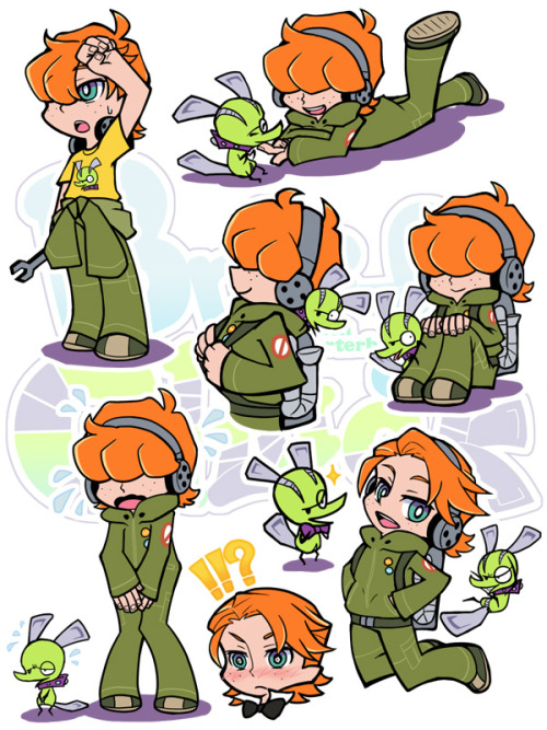
This was a idea I thought about during the Summer of 2012, it all started with a doodle of a few characters which became the first concept art for a series I plan to make eventually called The Uni-verse of Jack Miles.

The drawing consisted of 5 people, one who represented me, then another who represented another friend from university, after that I came up with an idea for a comic, so I drew a bunch of random characters and suddenly it was finished, I then gave each of them names and a personality. I tried to make each character completely different, to represent how first year at uni is like when you first move into your accommodation and you're living with people who you would normally never even think to associate with, the characters are:

  1. Jack Miles; A geek
  2. Cameron Wray; A stoner
  3. Kim Pickering; A book worm
  4. James Keen; A party animal
  5. Letty Pine; A nymphomaniac
The story would revolve around all these characters, though I was unsure to make a very long story or a series of stories about their uni life. The long story was going to be a romantic comedy based around Jack Miles and Kim Pickering, after sleeping together during a drunken house party, however I was fairly unsure about where to lead on after that, so far the plot for the entire story is undecided, however I have thought out the pilot episode through and started a script for it.

At first, the idea was going to be a comic, then after creating the comic using the stripes to create an animatic then to animate it, I still may go for that idea depending on how good my Flash skills before I ready the production of the series. The series isn't original by any means, but I think it would appeal to a lot of people out there, here is some concept art I created for it before moving back up to uni:


Untitled Idea:
Only a few weeks ago did I come up with this idea, it still needs alot of thought put into it but so far I am really excited for it. Completely different from The Uni-verse of Jack Miles, this one is a serious dramatic animation, based in a post apocalyptic icy future. Here is a very basic rundown of the pilot episode: 

The world is covered in snow and the human race has been resorted to living in huge glass domes. While the 80% of the worlds population is in these domes, the other 20% is at war, aliens have invaded earth and are destroying everything in their paths, these aren't your average sized aliens, they are huge aliens. In this world, you either live in domes, protected from the aliens but wait for food to run scarce, or join the army. However you have to be 18 to join, that's where our main protagonist and the story starts.

The entire story revolves around an unnamed boy, 16 years of age wanting to join the army and get out of the dome, eager to leave he has his mind set on one thing, finding a girl who he loves in the army. After she left for battle 8 months ago, he has been impatiently waiting, worried he decides to take action into his own hands and asks his good friend to help him sneak aboard a transportation vehicle so he can search for her himself. His friend is just about to leave for battle when he begs him to sneak him in the vehicle, the friend gives in, and hides the boy in a metal barrel. Just as they leave the dome, not even a minute into leaving they are attacked by a huge alien, the boy in the barrel has no idea what is happening and passes out in the barrel. When he awakens, he see finds a massacre of bodies, remnants of weaponry and vehicles and other rubble.

Little does the boy know, once you are out of the dome, there is no coming back. The dome is sealed on the inside, the boy looks over the snowy waste land, and decides to find the military base himself, a journey across the ice and snow begins.

I want the show to be similar to shows such as the Walking Dead, purely on the fact that its a zombie show, not entirely about zombies. I want this to be about aliens, but rarely do we ever see these aliens, we just acknowledge their presence and the destruction they are doing to the world. I want to open the pilot with a few commercials, advertising 3 things; The dome, the army, cooking pets book. Instead of having some voice over explain the plot I want these adverts to pretty much explain the situation on earth as it is, the adverts are similar to the adverts at the beginning of Metal Gear Solid 4 where they use them to explain what the world is like int he game. The world outside the dome is a world similar to the video game Fallout 3, a game that is set in 2077 in a retro-future, and takes place after a nuclear war. The world in Fallout 3 is incredibly well made and shows what the world would look like after a nuclear war, though my world wouldn't need as much destruction as most of the snow would cover it up.

I want the aliens to be huge, the size of skyscrapers. I want them to be an actual threat and hard to fight, I want them to be similar to the giants in Shadow of the colossus, I dunno how I should have them appear yet or much more detail than their size.

[Drawing Lesson] 01/11/12 - The Head!

Today we were greeted by our old friend Steve, our life model in the first year. Though the room we were to do life drawing in was booked so we had to resort to using a much smaller room. Not leaving much room to draw we had to resort into focusing on one part of the body, namely the head.


To start the lesson off we were told to draw Steve's head for 20 minutes, we had to go into major detail on the face and after rate how we did for likeness to Steve, and then for the overall proportions. I honestly think I did pretty bad, I didn't give him enough of a chin and his eyes look incredibly dodgy, though I do like the shape of the scalp, I reckon I got that pretty well drawn. After that we were told to draw the outline of Steve's face, and redraw it until we had it recognized and perfected.


After drawing the outlines of the head, we divided our paper into 10 segments, as Steve sat down for 5 minutes we had to draw him getting as many key features as possible, after each 5 minutes he'd turn a little bit to change position. After 5 drawings, the time limit for drawing them decreased into 4 minutes, we then had to carry on with a shorter amount of time, though Because I finish quickly that wasn't much of a problem for me.


Soon we had to split the our paper into 30 segments (We worked on A2 so it's due-able) and we started off drawing Steve for 3 minutes, we was sat down and he spinning around in his chair a little after each time, so we'd get a different angle each time. The 3 minute drawings on the top row were fairly easy, the 2 minute drawings that followed were fairly easy too. It soon went down to 1 minute drawings and my mind started to wander so my drawings got less human like. The drawings below the 1 minute mark were also 1 minute too and I started to rush the drawings since I wasn't finishing them right. It was only until the 30 second, 20 second and 10 second drawings were I started to focus, however it then became really rushed drawings and more outlines without detail by the end, though the bottom 2 rows are still my favourite drawings of the entire lesson.

Thursday 1 November 2012

[Showcase] Various Animations #1

The internet is a great source for animations, especially Youtube. You can host any animation you create there, and find a whole load of brilliant, humorous  moving and beautiful animated videos. Here I will talk about a few shorts, music videos and various other animations I have really enjoyed or want to share to show you, talk about them and to get your attention of.

Dye - Fantasy:


If you just watched it, I am sure you are as confused as I was, or as confused as anyone was who watched it. Personally, I think the song is amazing, and it has been one of my favourites for a while, the animation is incredibly well done and follows an anime influenced style. The story on the other hand, is incredibly abstract and very unpredictable, however I believe it has deeper meaning than what is seen to believe;

A group of teenagers break into a  local swimming pool for some night swimming, drinking a few beers and what have you. The four characters are all innocent ones, though like to have fun. The story is shown through the girls eyes, when she witnesses acts of a sexual nature she see's it as alien and monstrous and tries to run from her fate, knowing she has no choice she delves into the water and reaches adult hood represented by a large alien wasteland. When she enters the wasteland she is welcomed by a light, shining across her, this could be represented as the saying "The truth is like the sun, if you stare directly at it, you'll be blinded". The truth being about the truth of adulthood and how scary it actually is to witness first hand.

It is directed by a Frenchman known as Jérémie Périn, who writes and directs animated TV shows, video games and shorts. Before this animation he directed an adult comedy short music video called Flairs - Truckers Delight, though that is by no means as compelling as this animation, the story for Dye - Fantasy is stunningly original, incredibly unpredictable and has one of the most beautiful tracks I have heard in a long time.  

Wednesday 31 October 2012

[Inspiration] The Big Names

I can't really avoid making this, a blog entry about animators I have been following for years and aspire to be better than or just as good as, however I have avoided talking about them because almost everyone aspires to be like them or to be better than. In a earlier post I talked about two big named animators, Max Gilardi and Edd Gould. These two animators are among the best and most followed animators in the Flash animation community, though unfortunately Edd Gould passed away earlier this year. These two animators do inspire my work alot, however there are other animators who are just as big, if not bigger on the internet that I would like to talk about or atleast mention, though I wish I had done so earlier. I will again talk about Edd Gould and Max Gilardi and go in more detail about why I like them and about them in general. I think I will start out with the biggest name of them all, Arin Hanson Aka. Egoraptor.

Egoraptor:

Arin Hanson is among the greatest animators on the internet in my personal opinion, nothing can compare to animations like his, everything is near perfection; the voice acting, the character design, the art style, the humor and the way he presents his animations. Arin is one of the animation pioneers of the internet dating back to 2006 when he first started his Awesome series. He has improved massively since then, creating animations reaching over 700,000 subscribers on Youtube alone. Though with a famous animator, there are people who don't only use him as an inspiration, but pretty much copy the entire art style, humor style and even character style, examples of people like this is Spazzkidd and Twisted4000, animators with a style near identical to Arin Hanson's.

Arin will always be someone to inspire my work, though I do love his style I don't intend to copy his style or his unique sense of humor. He will always be someone I watch and gain the inspiration to animate from, below is an example of his work:


Eddsworld:

Edd Gould, again is one of the first inspirations I had when it comes to animation, and one could argue that he was one of the main reasons I got into Flash animation. Until he passed away during March 2012, he animated a series called Eddsworld, a series widely popular on the internet and due to its simplicity and popularity it spawned alot of clones, by this I mean drawings by other people with a style near identical to Edds, such as Derricksworld, and various others. What inspires me the most is how much he has improved, and I think this goes for alot of people, one of his first animations was one called Breakfast, by no means a work of art, then a few years later he improved to create an animation called 25ft Under the Seat, and finally before his death got half way to creating an animation called Space Face. Watching those 3 animation's you wouldn't believe that it was the same person animating, but just goes to show that practice pays off well.

Like stated before, Edd Gould is a huge inspiration to me, and proved that hard work in the end will pay off, it is sad to know that such an inspiration died so young, and I will try my best to be a great animator like him, below is an example of his work:


Harry Partridge amazes me with his animations, never before have I seen such a animator animate something so smoothly and beautifully. His animation's are near enough perfect, using frame by frame to animate he does this incredibly well and possibly the best I have ever seen. His animation style is unique on the internet, instantly recognizable by the Flash animation fanbase. His character designs are always different, they vary in shape and size and he is a great example of someone who creates characters well. His sense of humor is dark, which works well for his animation style, examples of this are Michael the Terrible Boyfriend and Chuck's New Tux, two of Harry's most popular animations.

Harry is one of those animators whose animations will blow me away every time, though I very rarely use frame by frame animation his work inspires me to keep animating so I can maybe one day surpass him. Below is an example of his work:


Jonathan Gran only recently caught my attention earlier this year after being shown an animation he did, and I was increadibly amused by it. Jonathan's animations aren't really what inspires me, but more of his humor and sense of humor. He creates 1 minute animations with a punchline at the end, or jokes all the way through it. Usually internet humor, such as with the Youtube Commenters animation and the Brony animation he created. I call this internet humor because it is humorous to someone who spends time on the internet and understands certain things that happen on it, his humor is based towards people who spend time on the internet and knows how to reach them. He usually does parodies of games, tv shows and movies, rarely does he make something original, though this again is reaching his target audience, creating something that people will look at and react like "Oh I have seen/played that, I might watch it". 

Jonathan is defiantly a favourite humor wise, he has such a unique sense of humor which makes him stand out in my eyes, though like said before his animation style isn't anything amazing, but it is made up with his comedic sense of humor. Below is an example of his work:


Hotdiggetydemon:

Max Gilardi, again is an inspiration to my work sue to the fact that we have a similar art style, and by this I mean we both use model animation. Max usually works on one series at a time, first being the Jerry series, second being the Wacky Game Jokez 4 Kidz series, and now he is working on the .Mov series. His style has never been different, using models and then manipulating the models mid animation. He has a very dark sense of humor, similar to Harrypartridges animations, though has recently boarded the Brony bandwagon and started creating My Little Pony shorts (The .Mov series). He is by no means my favourite animator, but I always look forward to see what he will release next.

As stated before, Max's work is similar to my work and I consider him someone I will hopefully one day be better than. He isn't my favourite animator but is defiantly up there on my list. Below is an example of his work:


Zach Hadel is an animator who took my attention in late 2011, though I have started to sway away from him recently. He usually parodies current pop culture phenomenons or creates his own sketches up, I only really started to watch his stuff in early 2012 when he uploaded a video parodying the internet phenomenon at the time, which was the Arrow to the Knee jokes. He parodied it incredibly well and in my personal opinion I think it was this that made his name on the internet. His animation style is similar to another animator, well known on the interent but doesn't inspire my work at all, OneyNG. They are both working together now to work on a new series oddly enough. I really like his animation style, though it isn't the most original style in the world, it is clean and easy to follow. In which I mean it doesn't have too much going on, his sense of humor works well, though similar to Ukinojoe he targets his animations to people on the internet and uses recent events to reach them, I like his humor and animation, though since the release of KONY2012 I have yet to see an animation to really catch my eye.

Zach is an odd animator to talk about, I really like his style and humor, though since March I have yet to see anything from him that is worth talking about, or even to inspire my work. Below is an example of his work:

[Animation Practice] 30/10/12 - Animation Preproduction

During today's lesson we watched a few animations we brought in, however before that we had a discussion about Storyboarding, types of camera shots, type of pans ect.

We touched upon every aspect in film and animation making, we started off with the basic one though; Storytelling. We talked about the three act structure again and the 3 meanings; the beginning, the middle and the end.


After we discussed storyboarding, we were informed that storyboarding goes through 3 different stages; A very rough design, a first pass of the shot and then finally a tidied up shot with key information about said shot. The storyboard is a very important process in animating, as it helps visualize the project and shows stage direction.

After this, we were told briefly a few key points about pre-production, this includes;

The Aspect Ratio;
1.33:1 - 4x3
1.78:1 - 16x9
2.35:1 - Cinemascope


Title safe, the green area. (See link above)
Action safe, the yellow area.
Cut off zone, the red area.


Composing with light
Selective focus
On a surface
Depth
Asymmetrical form
In line
In colour
Geometric shapes
Rule of Thirds

Extreme long shot
Long shot
Medium Long shot
Medium shot
Close up
Extreme close up

Horizontal/eye level
Down shot
Up shot
Tilt shot
Tracking in/out shot
Pan
Zoom
Zip pan
The shake
The tilt

180 Rule;
This keeps the character on one side, as to not confuse the audience on where to look when one person is talking.


Bar Sheet
Pipeline


This is just a quick run down of what we studied in the first half of the lesson, after we began to watch a few more shorts.


The first short we watched was one made by fellow class mate and close friend, Anthony Price called Oddball Omnibus, below is the animation:


The thing that I love about this animation, is that I watched each step throughout the year of the animation take place, I watched how it progressed through each scene, how the animation style improves slowly through the animation and the fact that I helped write the final few scenes... yaaaay! We watched it and talked about what we liked and didn't like about it, there wasn't much that people didn't like, it was mostly Anthony looking back at his work and realizing how much he has improved since creating this, everything else was positive feedback! After this we went to watch my other class mate and close friend's animation, Emma Pinder's Flow animation. Below is the animation:


We watched this animation and talked about what we liked and what we didn't like, pretty much good feedback, though we didn't talk that much about the animation though we discussed whether it is easy to follow or not, in which after a discussion about the animation we concluded that it was after you realize what is actually happening on screen. The other animation we watched was one that our tutor Rossie showed us, The Sandman... Because you know, Halloween and such! Below is the animation:


As much as I hate to admit this, and this gave me ALOT of dirty looking in lesson when I admitted this, I don't really like this type of animation, nor do I like Tim Burton movies. Before anyone gets on my case, I know this isn't created by Tim Burton, however Paul Berry after creating this then went to work with Tim Burton on the Nightmare before Christmas animation. I am not that much of a fan of puppet animation at all, manly because I have a slight Pupaphobia, nor am I a fan of clay animation, though I can tolerate it better than puppet animation. This animation is one HUGE reason why I have a strong disliking to puppets, they are freaky as hell! In this animation we discussed the use of light and camera shots used, which I did like fortunately about the animation.